

Twinings Superblends Sleep
Amazon PDP Gallery · E-commerce
Brand Guidelines
Strategic Research
E-commerce Creative
Brand Strategy
Creative Production Figma and AI
About
A designer task set by Luzern, a leading Amazon e-commerce agency. The brief asked for three PDP gallery images for Twinings Superblends Sleep, with a focus on health, wellness and functional benefits. The work had to demonstrate strategic thinking, brand interpretation and production execution.
The Brief
Create a minimum of three PDP gallery images suitable for Amazon. Interpret the Twinings Superblends brand guidelines, conduct strategic research for the messaging hierarchy, and deliver final assets. Include a short summary of the thinking behind the work.
The Idea & Creative Strategy
My starting point was the shopper, not the product.
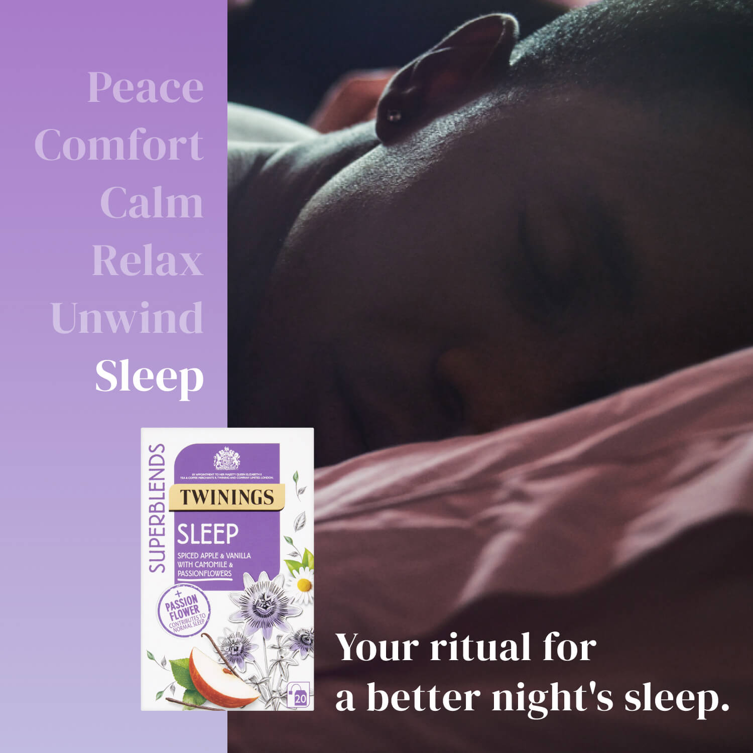
I researched what Amazon sleep tea buyers actually search for, and more importantly, what they want to feel. Words like peace, calm, relax, unwind. Those emotional outcomes became the foundation of the messaging hierarchy before any design decision was made.
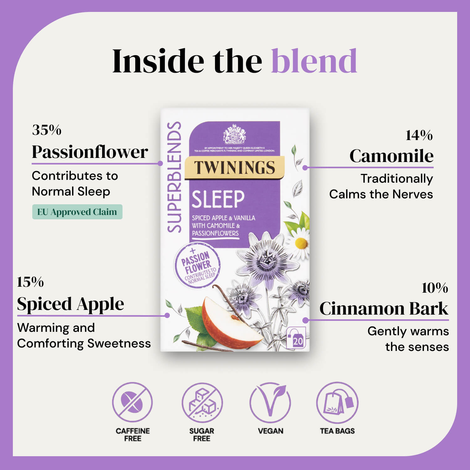
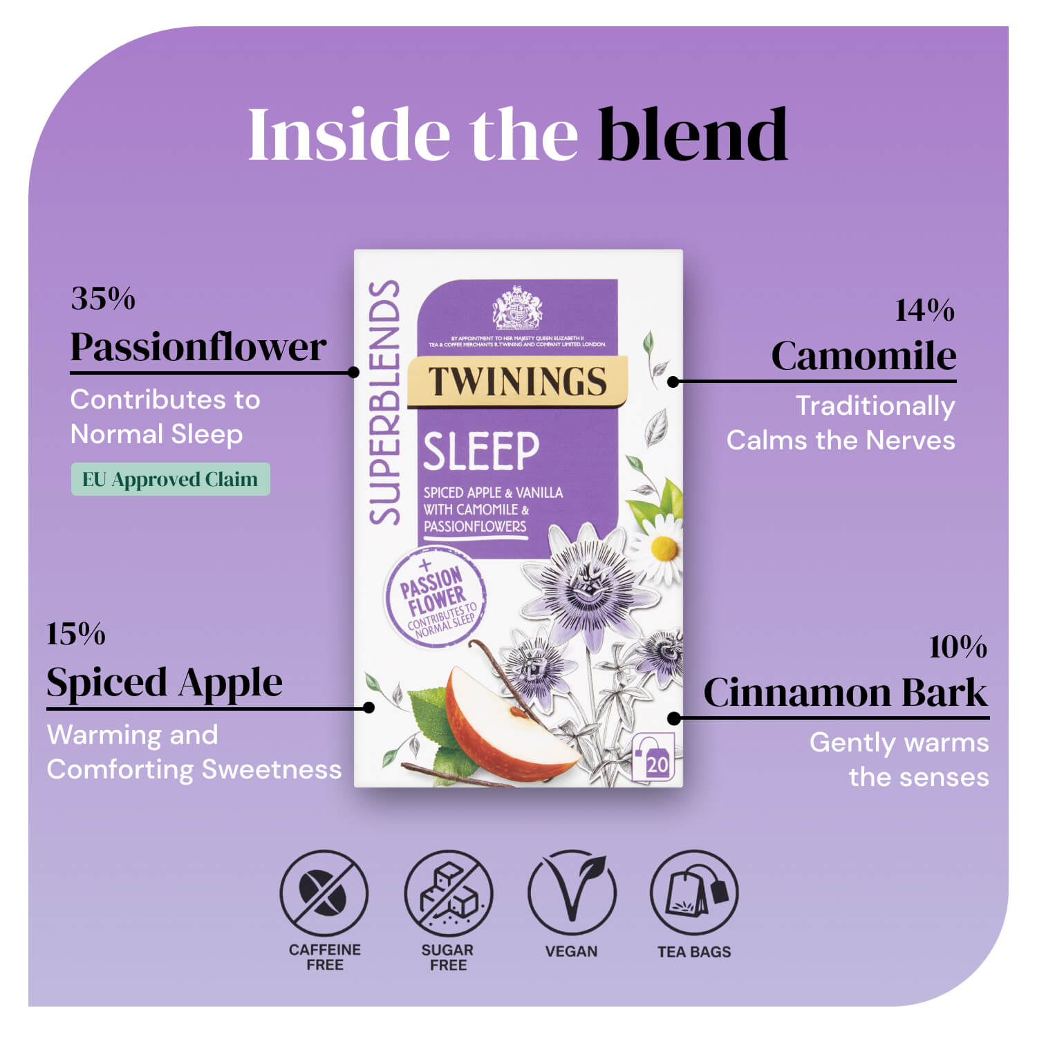
From the full Superblends range I chose Sleep. It had the strongest story: Passionflower at 35% carries an EU-approved health claim competitors can't replicate, it's fully caffeine free removing the main purchase barrier, and the blend gives a clear four-ingredient narrative.
The three images were then structured to answer one question a shopper asks in sequence.
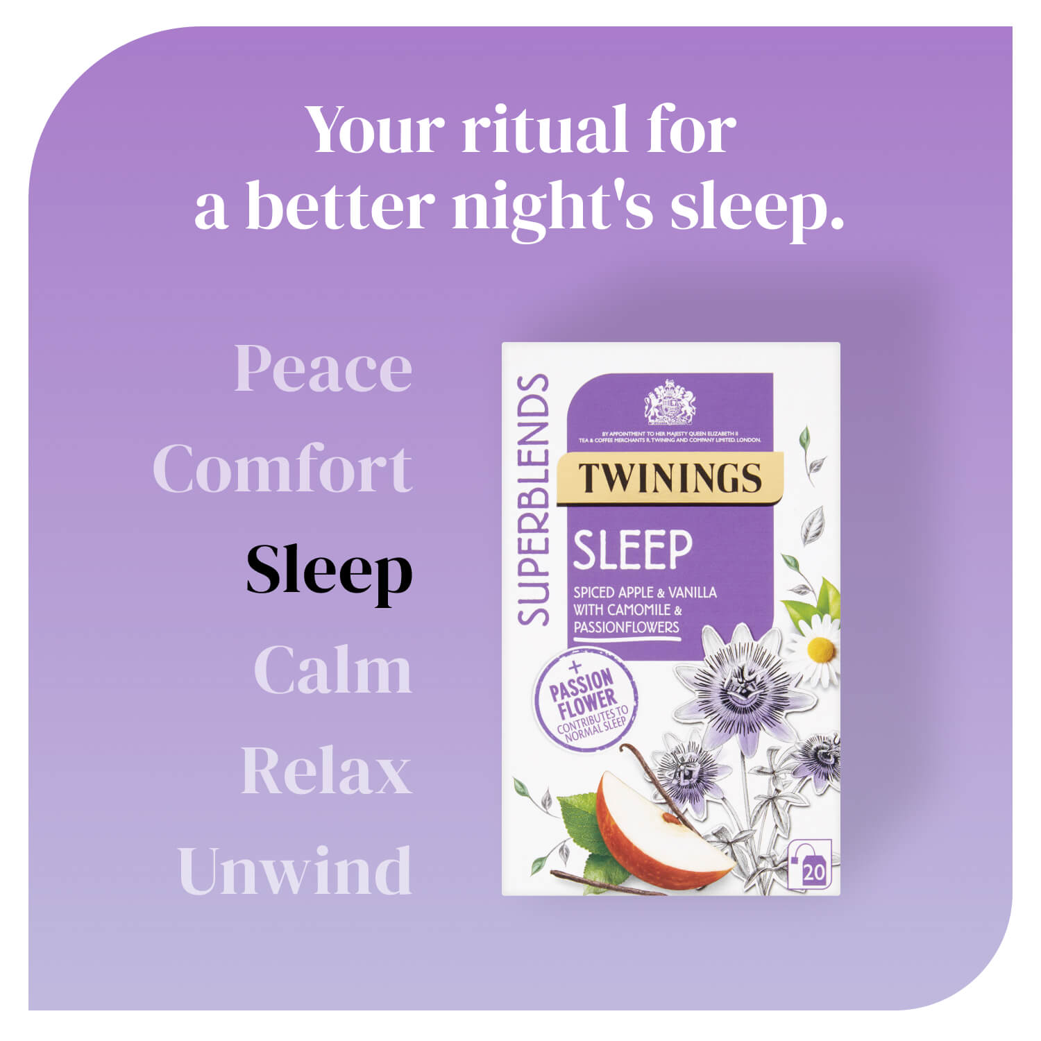
Image 1 - Hook. Words describing what the shopper wants to feel sit on the left (based on data/insights for keword seach), building emotional desire before the headline lands the promise: your ritual for a better night's sleep.
Image 2 - Proof. A curious, direct headline, Inside the blend, leads into transparent ingredient percentages with the EU-approved Passionflower claim as the hero proof point.
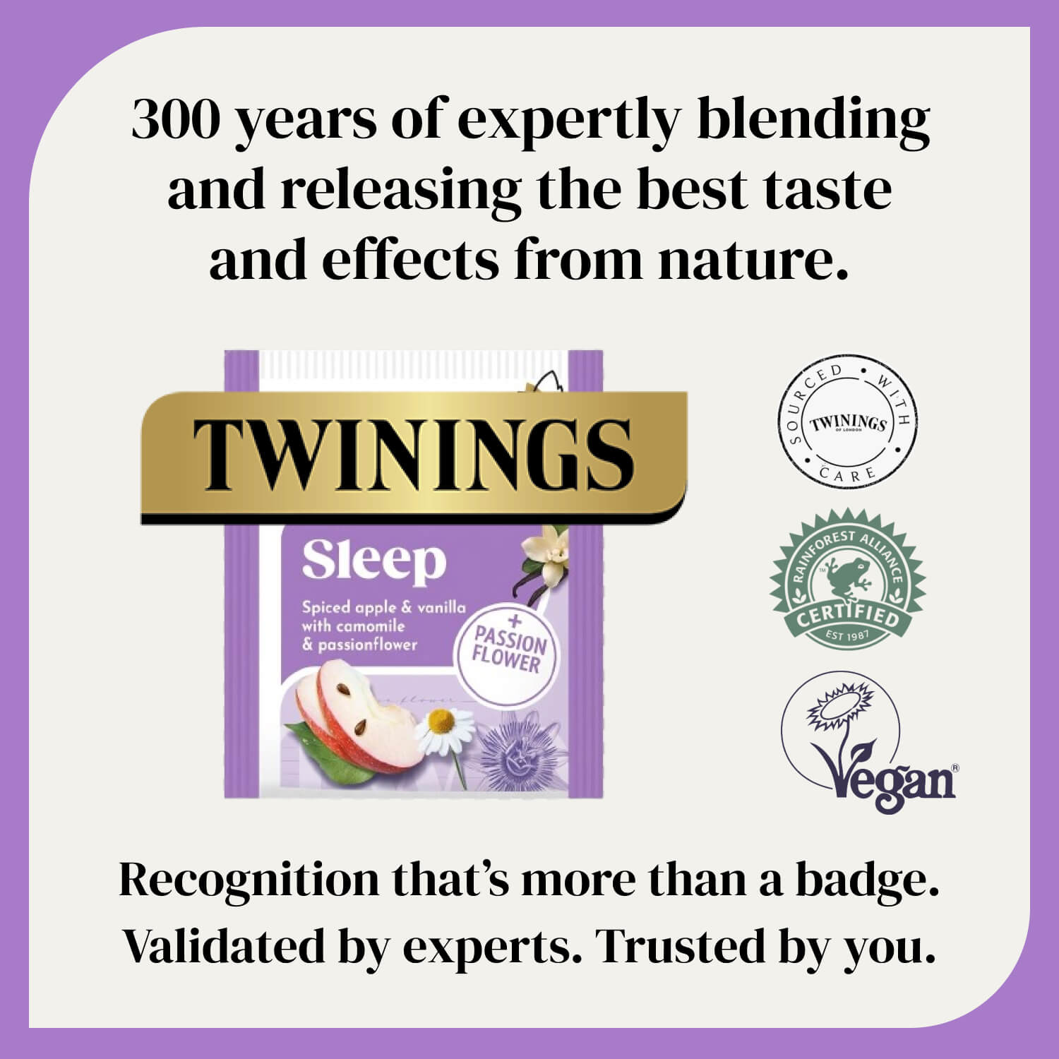
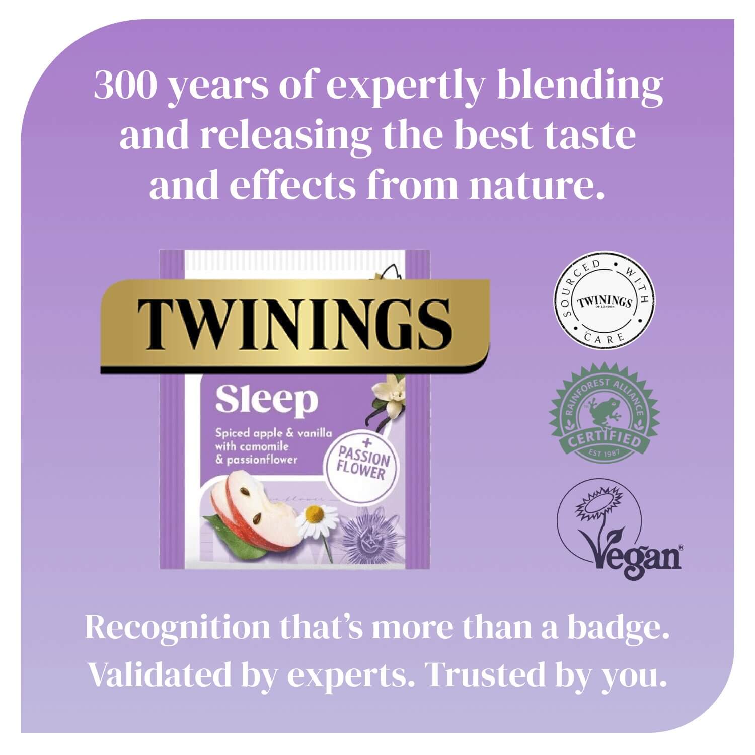
Image 3 - Trust. 300 years of heritage opens before anything else. The Twinings brand book RTB, gold logo, verified certifications and a closing brand line answer the final question: can I trust this brand?
Production Process
Three complete gallery sets were developed, each exploring a different visual treatment, dark lifestyle, cream with purple border frame, and full purple, while keeping copy, structure and design system identical throughout.
The purple rounded border frame was introduced as a deliberate design container: it creates brand recognition and a premium quality signal that mirrors the Sleep product's core colour. The full purple version takes the same thinking further, using the brand colour as the entire background for maximum shelf impact in Amazon search results.
The product pack or sachet is present in every image across all three versions, ensuring the shopper always has a visual product anchor regardless of which image they land on first.
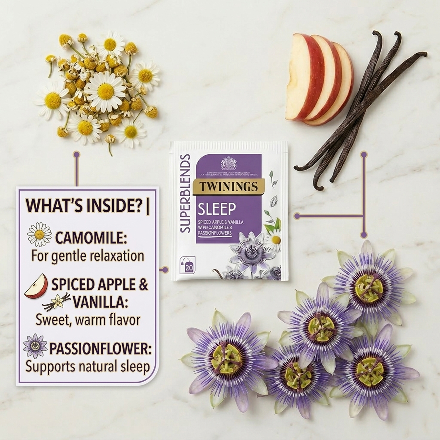
Additional ideation images were also created, flat lay ingredient photography, lifestyle composites (AI generated), and alternative hook layouts, as part of the broader creative exploration.
Creatives


Gallery 1

Gallery 2
Gallery 3


Additional images