"Unlock the World"
Cross-Border Payments & Multi-Currency Campaign Concept
Global Integrated Campaign
Art Direction / Copy / Imagery
Prompts / Gen AI
About
This self‑initiated concept started from a real traveller problem: managing money across borders without hidden fees or friction. Grounded in audience research and competitive insight from fintech players like Monzo and Wise, the project explores how Revolut could better support travellers before, during, and after a trip. Using the card opening a hotel door as a central metaphor, the idea positions Revolut as the key that opens the world, making cross‑border payments simpler, fairer, and genuinely stress‑free.
The Brief
Revolut needed a campaign concept that communicated its core fintech differentiator, seamless cross-border payments and multi-currency spending, in a way that felt aspirational, not technical.
The challenge: Translate a complex financial product into an instant, emotional, human idea.
The Idea
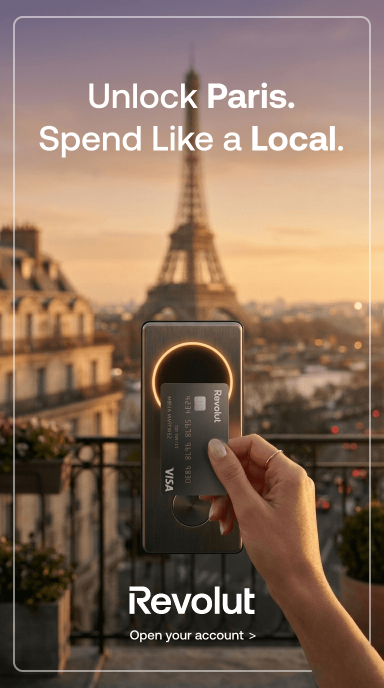
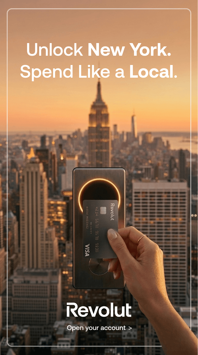
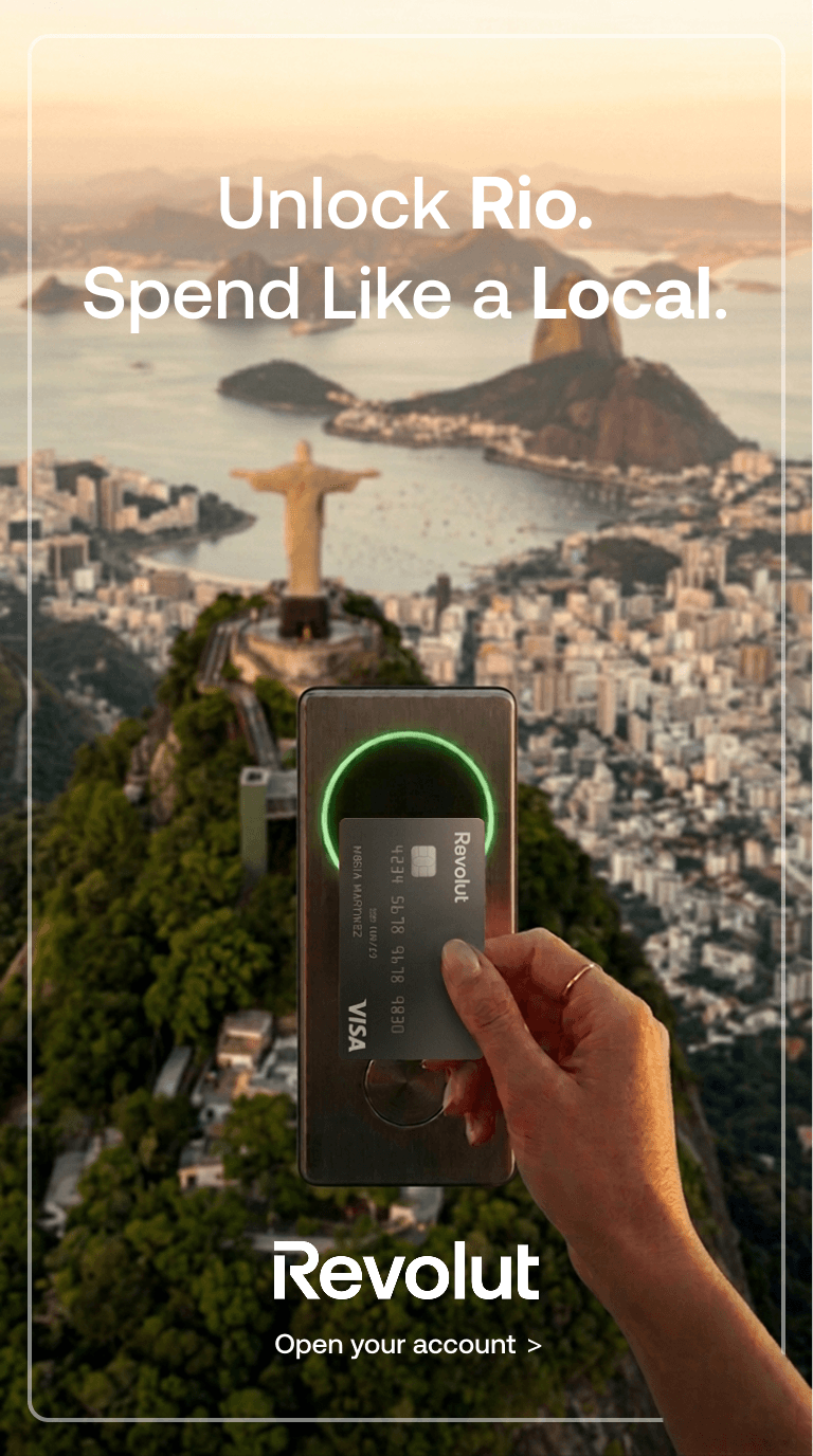
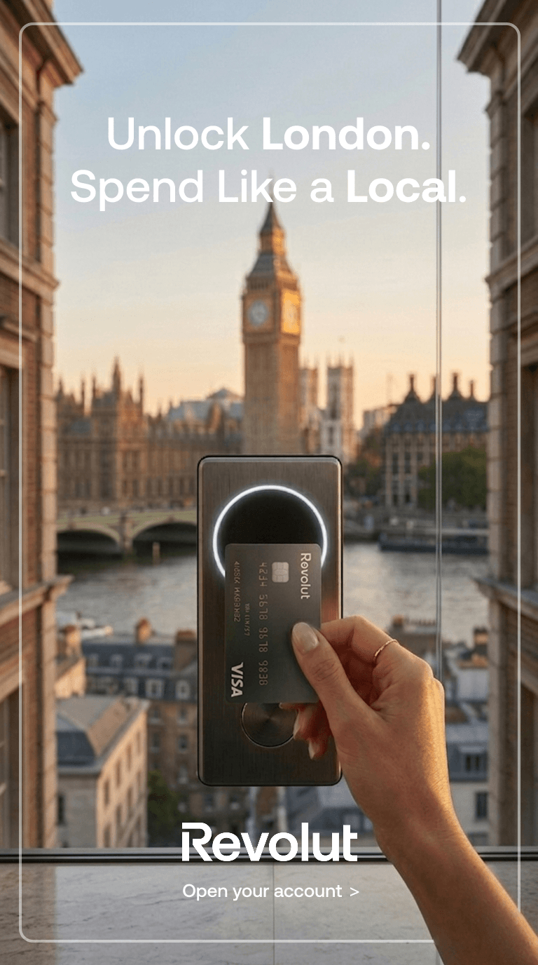
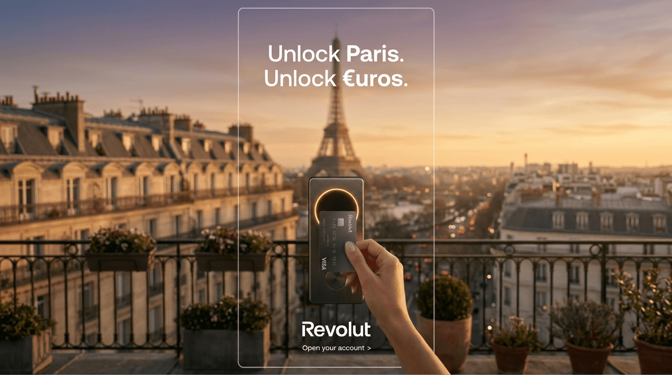
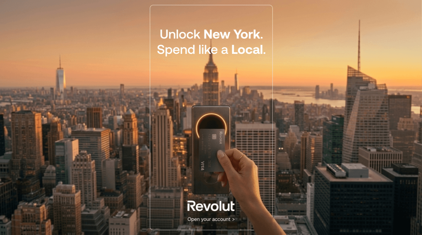
Your card is the key. The world is the door.
The concept was built around a single powerful metaphor: the Revolut card as a literal key, unlocking not just a city, but the currency and lifestyle within it. A door-lock device becomes the visual bridge between the physical world and financial freedom, turning a tap of a card into an act of access.
The campaign was designed as a modular, scalable system, the same visual language and "Unlock [City]. [Currency action]." copy structure can be deployed across any city in the world, making it infinitely adaptable for geo-targeted digital campaigns.
Two copy directions to test
Variant A
Variant B
"Unlock Paris. Unlock €uros."
"Unlock Paris. Spend Like a Local."
Currency-forward, product-led
Lifestyle-forward, benefit-led
Leans into the fintech identity, the typographic trick of using the € symbol inside "€uros" reinforces the brand's multi-currency USP visually.
Leans into traveller empathy, "Spend Like a Local" speaks directly to the pain point of foreign transaction fees and currency confusion.
Production Process
01 - Ideation & Copywriting
Concept development and copy exploration initiated through AI-assisted brainstorming with ChatGPT and Claude.ai, testing copy directions, refining the core metaphor, and pressure-testing the message against Revolut's brand positioning and fintech category conventions.
02 - Visual Concept & Art Direction
Art direction brief developed with a clear visual language: premium golden-hour photography, shallow depth of field, iconic city landmarks, Revolut Metal card as hero product, glowing lock device as the conceptual anchor.
03 - Creative Production
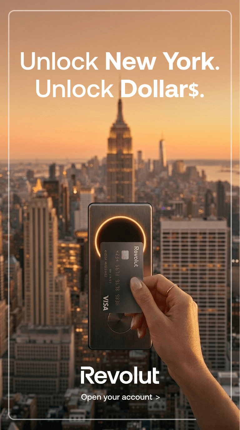
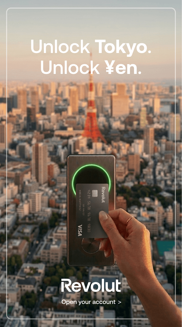
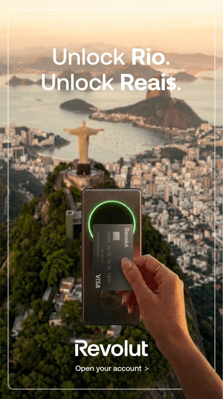
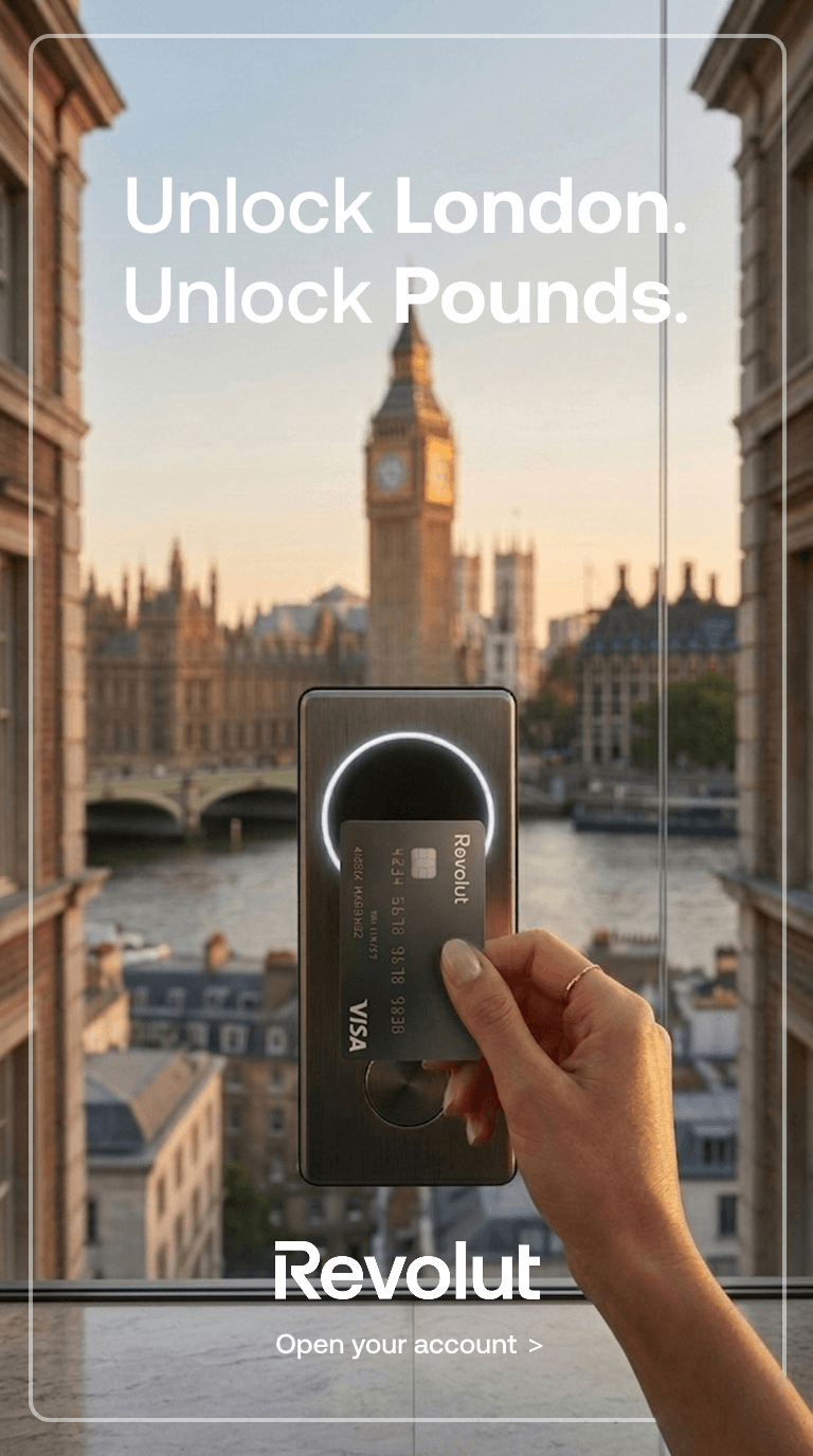
Final visuals generated using Nano Banana Pro (Generative AI creative platform), producing photorealistic, production-ready executions across market variants (Paris/€uros, London/Pounds, New York/Dollar$, Tokyo/¥en, Rio de Janeiro/Reai$) with consistent visual identity and brand guidelines.
04 - Campaign System
Delivered as a scalable creative system ready for geo-targeted deployment, same template, any city, any currency.
Creatives
All visual assets conceived, directed, and produced entirely through GenAI, static and motion, global and local executions.
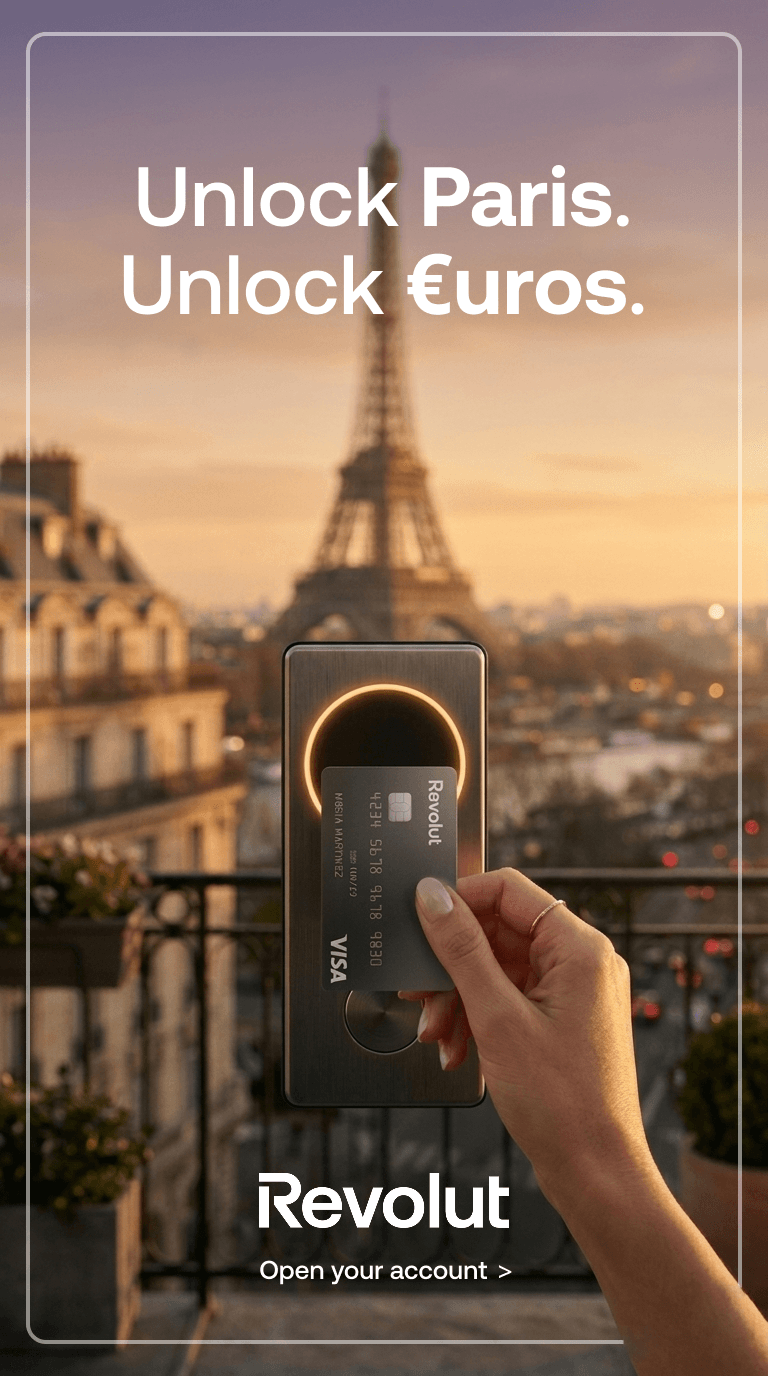
Unlock Paris. Unlock €uros.
Creative for a global fintech campaign designed for performance across Meta, YouTube and Google.Includes 6-second vertical video (9:16) and static carousel formats, optimized for Facebook Reels and paid social.The concept “Unlock Paris” brings the product to life through a seamless interaction, transforming a simple card tap into an immersive travel moment.